Typography is one of the most important elements of any design. The right font can make your presentation more professional, your social media graphics more engaging, and your marketing materials more memorable. The wrong font, however, can make even a beautifully designed project look unpolished.
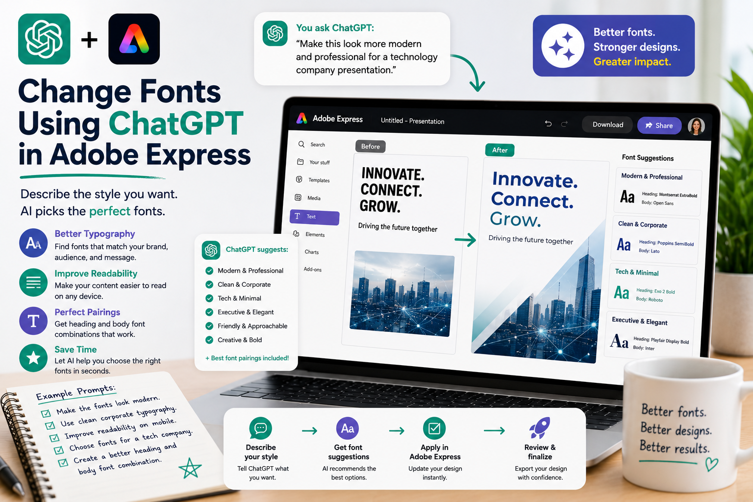
Traditionally, selecting fonts required browsing through long font libraries and manually testing different combinations. By combining ChatGPT with Adobe Express, you can simply describe the style you want, and AI helps you choose typography that fits your project.
In this guide, you’ll learn how to use ChatGPT to make smarter font choices, improve readability, and create more consistent designs in Adobe Express.
Why Fonts Matter
Fonts communicate personality before anyone reads the content.
A font can make your design feel:
- Modern
- Corporate
- Friendly
- Elegant
- Creative
- Technical
- Luxurious
- Minimalist
- Professional
- Fun
Choosing the appropriate typography helps reinforce your message.
Traditional Font Selection
Without AI, font selection often involves:
- Browsing hundreds of fonts
- Comparing styles
- Testing different weights
- Adjusting sizes
- Pairing headings with body text
- Repeating the process until it looks right
While experienced designers enjoy this process, it can be overwhelming for beginners.
Describe the Style You Want
Instead of selecting fonts manually, simply tell ChatGPT your design goal.
Examples include:
Make the typography look more modern.
Use a clean corporate font.
Choose fonts suitable for a technology company.
Make this look elegant and premium.
Use playful fonts for children.
AI interprets your request and suggests typography that matches the overall style.
Improve Readability
Sometimes your goal isn’t changing the style—it’s making the content easier to read.
Try prompts such as:
Increase the readability.
Make the headings stand out more.
Improve the body text for mobile devices.
Create better spacing between headings and paragraphs.
Make the report easier to scan.
These instructions focus on the reader’s experience instead of technical font settings.
Match Your Brand
Consistent typography strengthens brand recognition.
Examples:
Use fonts that match our technology brand.
Apply professional corporate typography.
Use the same font style across the presentation.
Make this consistent with our existing marketing materials.
ChatGPT helps maintain a unified visual identity across multiple projects.
Pair Headings and Body Fonts
One common design challenge is selecting font combinations.
Ask ChatGPT:
Suggest a modern heading and body font combination.
Or:
Recommend fonts for an annual business report.
Or:
Create typography suitable for an educational presentation.
Rather than choosing fonts independently, AI considers how they work together.
Design for Different Audiences
Different audiences respond to different typography styles.
Examples:
For executives:
Use clean corporate typography.
For startups:
Use modern, bold fonts.
For education:
Choose friendly, readable fonts.
For luxury brands:
Use elegant typography.
For children’s materials:
Select playful fonts with excellent readability.
Typography becomes part of your communication strategy.
Improve Social Media Graphics
Fonts are especially important on social platforms where users scroll quickly.
Examples:
Make the headline larger.
Use bold typography for Instagram.
Make this easy to read on a smartphone.
Create an attention-grabbing title.
Optimize the typography for Pinterest.
Simple changes can significantly improve engagement.
Use Natural Language Instead of Technical Terms
You don’t need to know font terminology.
Instead of saying:
Increase font weight to SemiBold.
You can simply write:
Make the headings stronger.
Instead of:
Increase line height to 1.5.
Try:
Add more breathing room between the lines.
Natural language makes typography accessible to everyone.
Example Prompts
Here are several prompts you can reuse:
- Make the fonts look more modern.
- Use clean corporate typography.
- Increase the heading size.
- Improve readability on mobile devices.
- Create more contrast between headings and body text.
- Make the presentation look premium.
- Use fonts that fit a healthcare company.
- Choose typography suitable for a technology startup.
- Make this infographic easier to scan.
- Use elegant fonts for a luxury brochure.
Best Practices
For the best typography results:
- Prioritize readability over decoration.
- Limit the number of font families.
- Maintain consistent heading styles.
- Ensure sufficient contrast.
- Consider mobile viewing.
- Match fonts to your audience.
- Stay consistent with your brand identity.
Good typography supports your message instead of distracting from itCommon Mistakes to Avoid
When using AI-assisted typography, avoid:
- Mixing too many fonts.
- Using decorative fonts for long paragraphs.
- Choosing fonts that are difficult to read.
- Making headings and body text too similar.
- Ignoring spacing between text elements.
- Forgetting to check readability on smaller screens.
Keeping typography simple usually produces more professional results.
Conclusion
Typography plays a critical role in effective design, but choosing the right fonts doesn’t have to be difficult. By combining ChatGPT with Adobe Express, you can describe the style, audience, and purpose of your project using natural language, allowing AI to recommend typography that enhances both readability and visual appeal.
Whether you’re creating business reports, presentations, marketing materials, educational content, or social media graphics, conversational font selection helps you create polished, professional designs with less effort.
Related Articles
- How ChatGPT Automatically Finds Adobe Express Templates
- Using Natural Language to Edit Adobe Express Designs
- Replace Images with ChatGPT Commands
- Create Marketing Materials with ChatGPT and Adobe Express
- Create Executive Dashboards with ChatGPT and Adobe Express
- Create Business Performance Reports with ChatGPT and Adobe Express